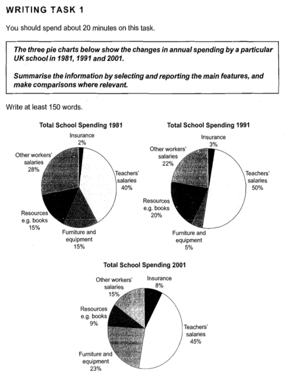
These 3 pie charts indicate changes in money spent on different resources by a particular UK school in 3 different years with 10 years gap between them. Most money has always been spent on teachers' salaries in all of the years represented – 1981, 1991, 2001.
The only thing that has varied slightly is teachers' salaries that accounted for 40% of total school spending in 1981, rose to 50% in 1991 and later declined to 45% in 2001. The percentage for insurance has risen 4 times since 1981 – it was 8% in 2001. Unfortunately, schools were spending less money on other workers salaries in 2001 (15%) than they were in 1981 (28%). Percentage of money spent on equipment and furniture has risen as well from 15% to 23% in 2001, although, it declined to only 5% in 1991. Also, schools in 2001 were spending less money for resources than in 1991 or 1981, this percentage is less than a half of what was spent in 1991.
Overall, percentage of money spent on teachers' salaries has declined only slightly and it is around a half of the money spent in each year.