Please evaluate my Task 1 essay(Pie chart). Thank you!
Posted: Wed Mar 22, 2017 9:18 am
The pie graphs below show the comparison of different kinds of energy production of France in two years

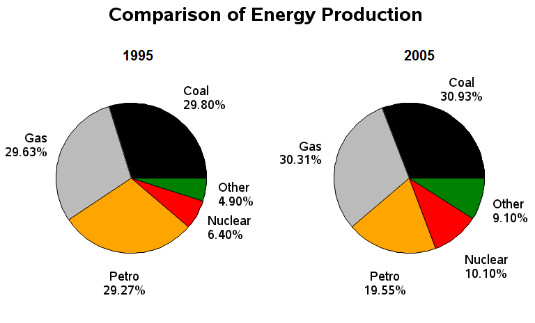
The given pie charts provide a comparison of the proportion of energy produced by five types of sources, namely coal, gas, petro, nuclear and others in France during the years 1995 and 2005. Overall, the trend appears to have been stable during the ten year period with coal, gas and petro being the main sources of energy, and others being the least used.
In 1995, coal, gas and petro were the primary sources of energy. The total energy produced from these three amounted to almost 90% of the total energy production where each one of them produced around 30% approximately. Nuclear and other sources of energy appear to be the least used, and only around 11% of the total energy was produced from them.
10 years later, in 2005, the trend changed slightly. Coal, gas and petro still remained the main sources of energy, but the proportion of petro used in energy production fell from just under 30% to 19.55%. There was, however, a modest increase in the usage of nuclear power and other types of sources. They rose from around 11% in 1995 to almost a fifth in 2005.